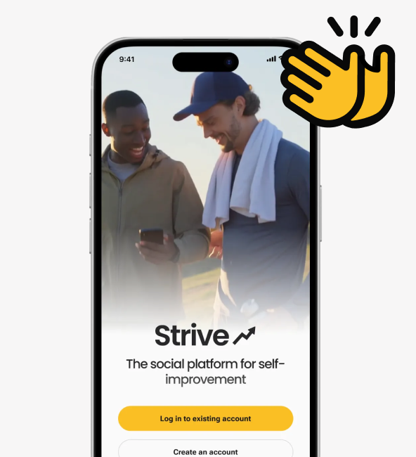
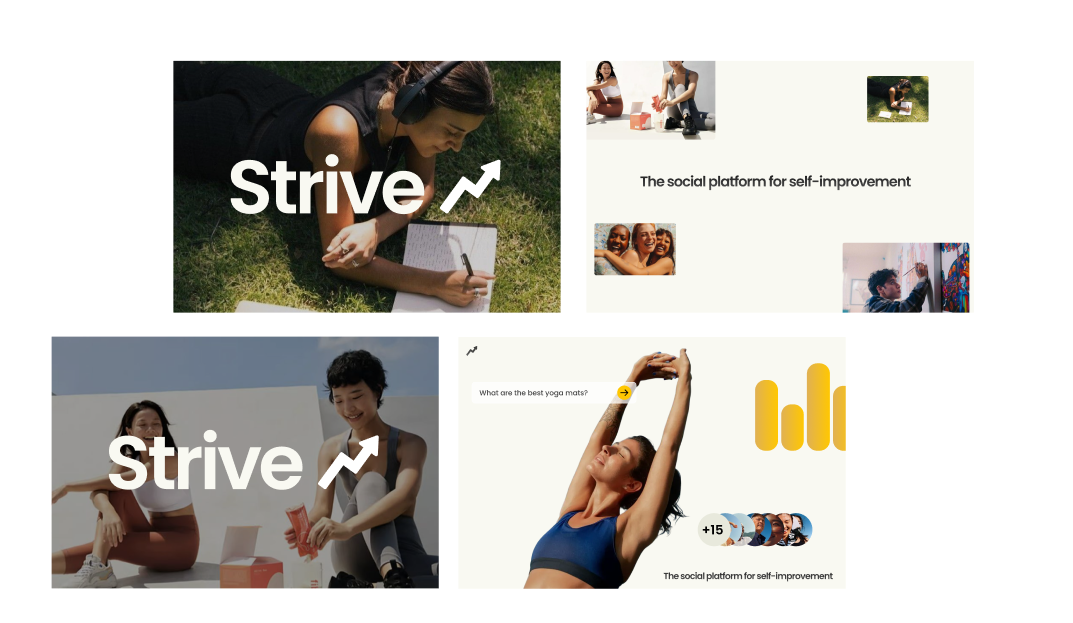
Strive: A social platform for self-improvement
A friend came to me with an early-stage habit tracking concept. What started as a UI polish request became a full product redesign: defining the brand, running user research, establishing product strategy, and delivering a differentiated experience from the ground up.
TIMELINE
3 Weeks
ROLE
Lead Designer
TOOLS
Figma
Heads Up!
The app is currently in development and actively being refined. We’re excited to share that it’s on track for release soon.
The opportunity
Have you ever found yourself tracking something through photos? For me it was cooking. I loved photographing every home-cooked meal and looking back to see how much progress I was making over time. That experience made me wonder what if there was an app built specifically for that kind of visual, personal tracking?
Validating the concept before designing it.
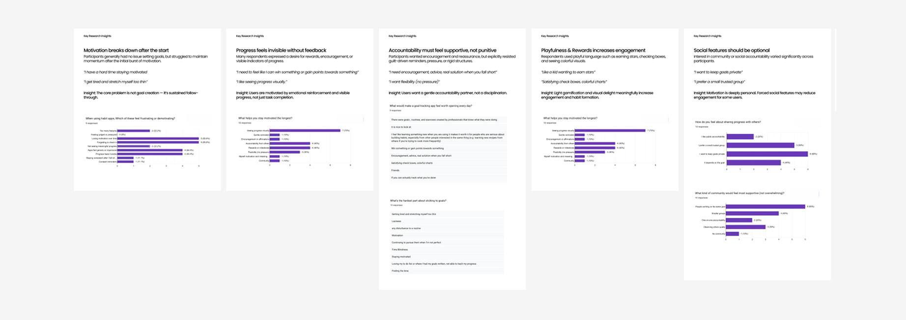
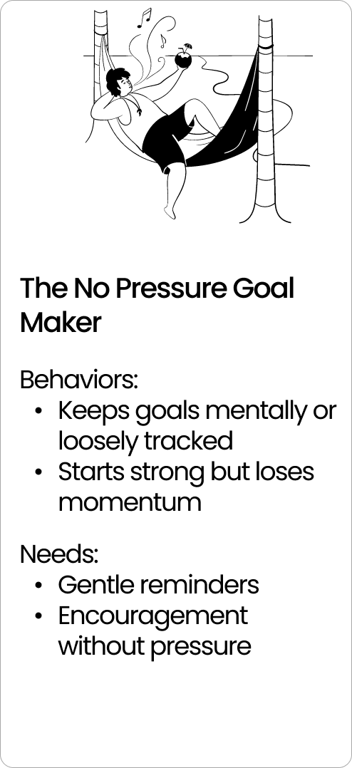
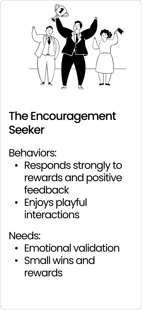
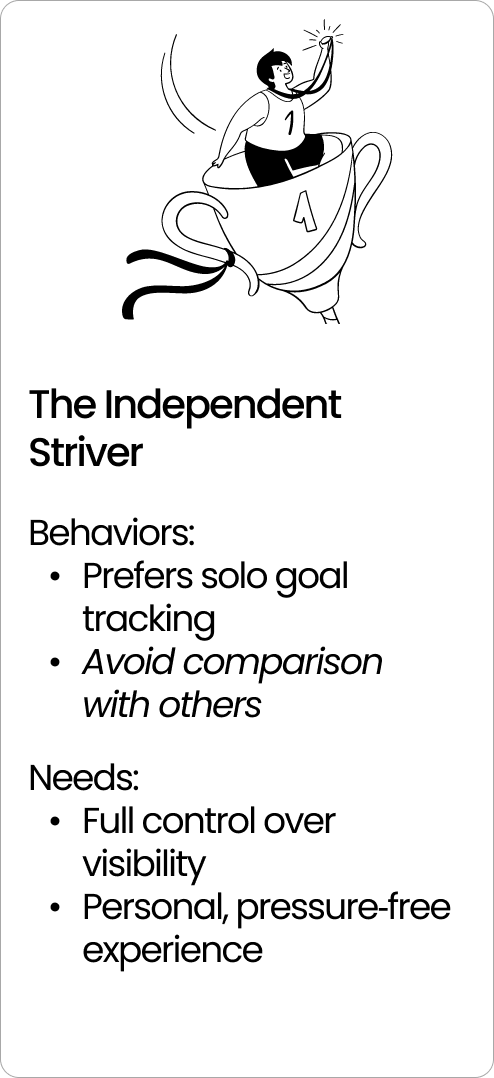
With limited time and resources, I validated the concept using a fast, structured questionnaire to test two core hypotheses: that users struggle with habit consistency, and that a social layer could support rather than hinder that process. The responses were synthesized into three user personas that served as decision-making tools throughout the product and directly informed every major feature in Strive.
From the research, I distilled behavioral and attitudinal patterns that became three key insights, each mapped to a core feature. These insights shaped design decisions that prioritized community without surveillance and progress without performance, ensuring every feature was grounded in real user needs.
Some of our main insights
Using the questionnaire results, I synthesized raw responses into behavioral and attitudinal themes to surface patterns that generalize beyond individual answers. This was used to create three distinct user archetypes— each representing a different relationship to habits, social sharing, and accountability.
Insights → Personas → Design Decisions
Three insights. Three features. Each core feature in Strive was derived directly from a research insight, not from trend analysis or competitive copying. The research didn't just validate what to build, it gave us the confidence to build it differently. In a space full of apps that default to public accountability and engagement pressure, our users told us they wanted something quieter. Community without surveillance. Progress without performance. Those insights meant some of our design decisions would look counterintuitive from the outside — like a social app that protects privacy, or a community feature where watching counts as participating. But each choice traces directly back to what users said they actually needed.
FEATURE ONE
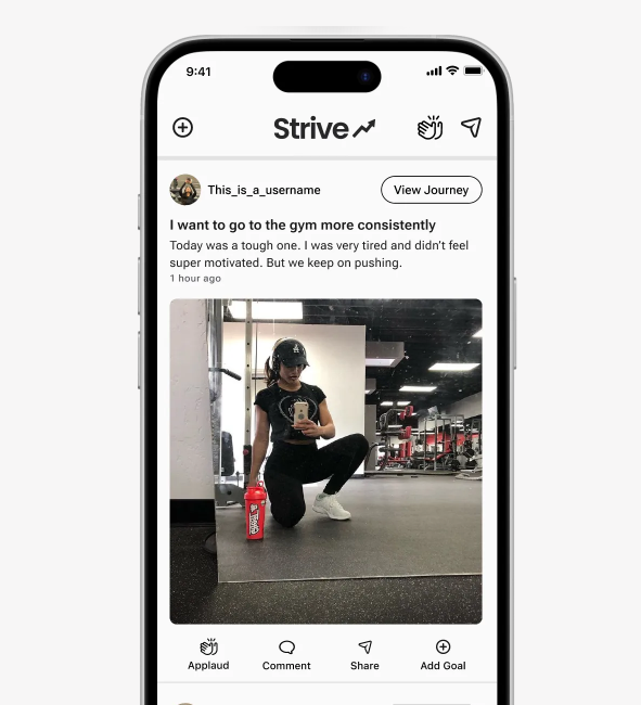
Goals are presented as visual journeys that emphasize progress over deadlines or strict scheduling.
Progress visualization over deadline-driven tracking because users who see how far they've come stay more motivated than users counting down how far they have left to go.
Research Insight
Visual progress is the single strongest motivator in the study - stronger than accountability, rewards, or flexibility. Users don't need more reminders; they need a clearer picture of their own momentum. This points to an interface that leads with progress visualization, not task completion.
► 70% say seeing progress visually keeps them motivated the longest (the strongest signal in the entire study)
► Accountability from others (40%) and rewards/milestones (40%) are secondary
► Flexibility (30%) matters more than reminders or affirmations
FEATURE TWO
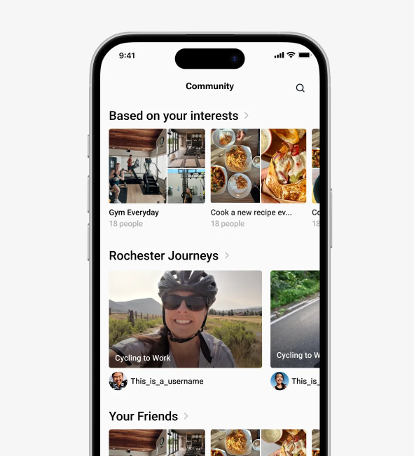
Users want community, but only when it’s goal-aligned and low-pressure
Community features scoped to shared-goal contexts because users don't want a social network, they want to feel less alone in their specific pursuit.
Research Insight
Users aren't anti-social — they're anti-irrelevant-social. The research revealed a clear preference for community that's contextually matched to their goal. Importantly, passive participation ("lurking") was validated as a legitimate and valuable mode of engagement. The product shouldn't pressure users to post; it should make observation feel as worthwhile as contribution.
► 60% of respondents find communities most supportive when people are working toward the same goal.
► 30% of respondents feel most supported by simply "observing others quietly," suggesting that "lurking" provides value without the pressure of active participation.
► Only 10% of respondents feel that "no community" is the most supportive option, indicating that 9 out of 10 people still want some level of connection.
FEATURE THREE
The option to keep things private
Granular privacy settings that let users be social on their own terms — resolving the tension between wanting community and fearing exposure.
Research Insight
60% of users want to keep their goals private. But only 10% want no community at all. That gap is the product opportunity. Users aren't asking to be alone — they're asking to feel safe. And a user who feels safe is far more likely to actually engage, post, and stay in the app long term.
We wanted to make posting feel low-stakes by default If the default share setting has "friends only" and "private," posting feels less like performing and more like journaling. You remove the fear of public judgment, so the barrier to hitting share drops significantly.
► 60% of participants explicitly stated they want to keep their goals private.
► In contrast, only 20% of users enjoy public accountability.
► This suggests that while users want to be with others working on similar things, they may not want to be monitored by them.
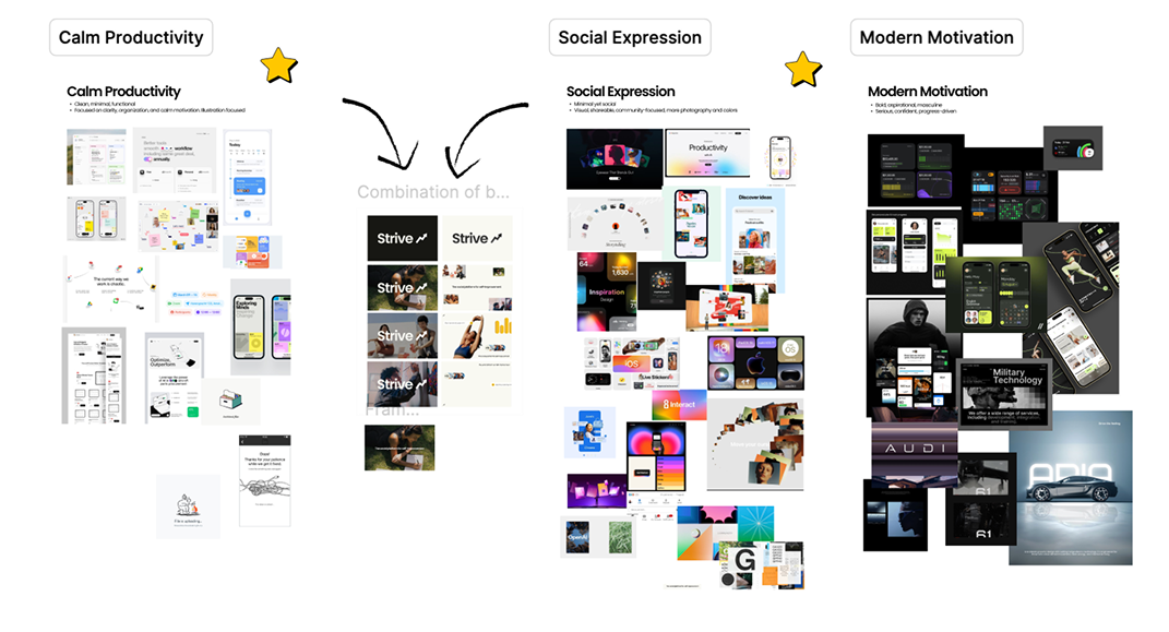
Building the brand from research up
The research didn't just inform features, it directly shaped the brand direction. Users wanted to feel supported, not pressured. Motivated, not monitored. That translated into a clear set of brand constraints: no competitive aesthetics, no hustle culture imagery, no gamified urgency. The visual and verbal identity needed to feel calm, human, and genuinely encouraging.
I developed three mood board directions and worked with the founder to align on one, then translated that direction into a brand document built for handoff, covering voice, color, typography, and visual principles. The document was designed to be usable by marketers and social media teams who weren't in the room when the decisions were made.
From concept to differentiated product
Strive started as a request to improve a UI. It became something much larger — a full product rethink grounded in research, strategy, and brand definition. By taking the time to understand who the app was actually for before touching the interface, we were able to make design decisions that looked unconventional but were defensible at every turn. The result is a product with a clear point of view: that self-improvement is more sustainable when it feels social without being performative, and that the best habit-tracking app isn't the one that pushes you hardest — it's the one that makes showing up feel safe enough to do every day.
View More Projects

LOCKED: Luxury Dishwasher UIDesigned for GE Appliances: a dishwasher interface Elevating luxury and innovation
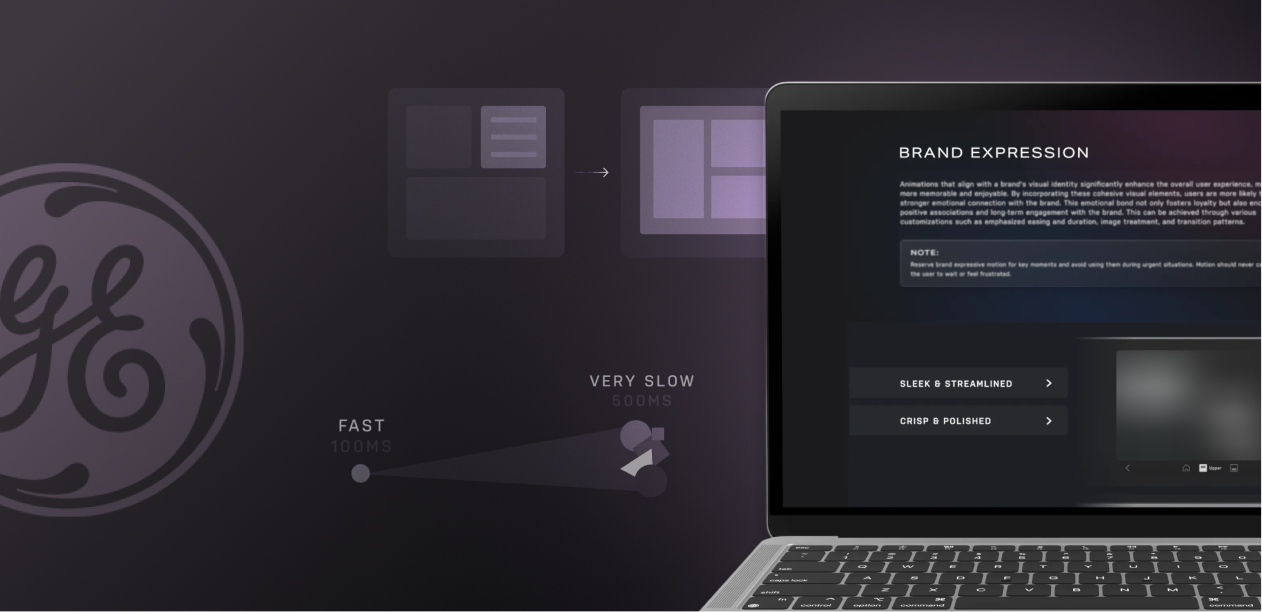
LOCKED: ROUX Motion GuidelineBuilt motion guidelines for the GE Appliances design system, bridging design and development
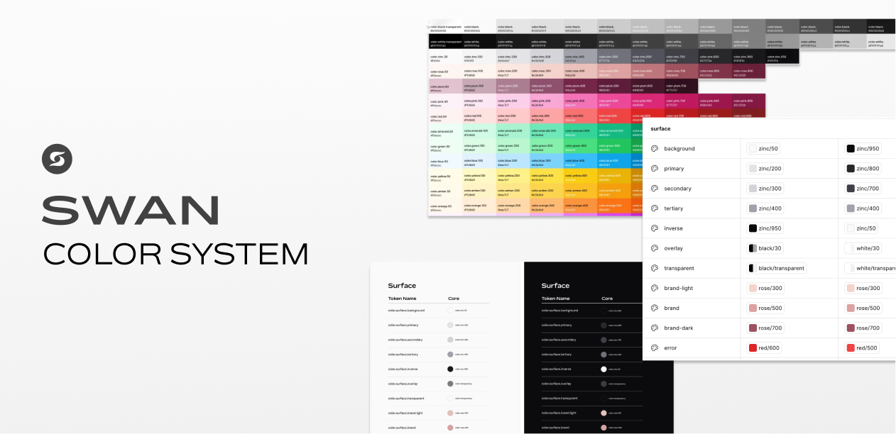
LOCKED: SWAN Color SystemA semantic color system built to give designers a single, self-documenting source of truth.
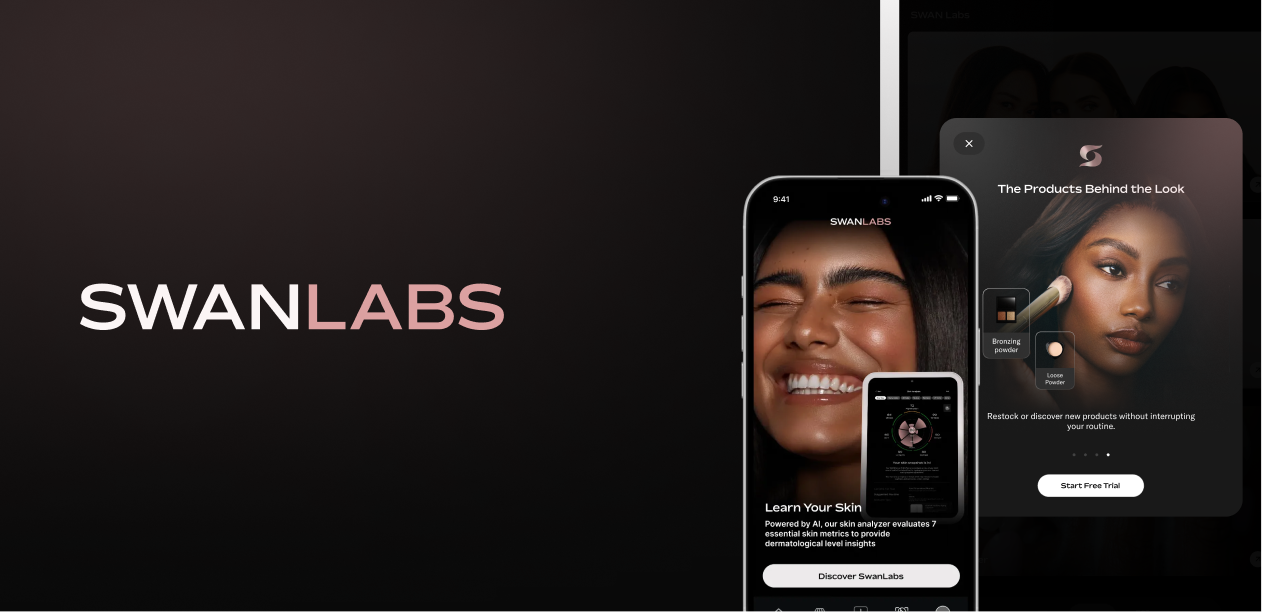
LOCKED: Swan Smart MirrorA redesign of Swan Labs' AI-powered skin analysis, shade matching, and AR makeup mirror and mobile experience.
LOCKED: Smart Appliance Widgets & AppsDesigned scalable, consistent smart appliance interface using ROUX design system